Showing posts with label Colour. Show all posts

Monday, December 30, 2013

Illustration Unit: Maxfield Parrish


The last illustrator of the Golden Age for the unit is Maxfield Parrish, another influential american artist who worked in book illustration and commercial art during the first half of the twentieth century.


He is known for his intense use of colour; neoclassical figures and drapery; big open skies full of stratocumulus clouds; and painstaking three-dimensional realism achieved through extensive glazing with oil paints.


Sunday, December 29, 2013

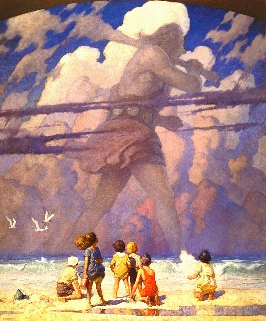
Illustration Unit: N.C. Wyeth


One of the biggest american illustrators is N.C. Wyeth (Newell Convers). He was a gifted artist as a child and went to a few art colleges before joining Howard Pyle's art school when he was twenty years old. Within a few months, he was commissioned to do a cover for the Saturday Evening Post and his career took off from there.


He went on to produce over 3000 illustrations and 112 books in his career. He also started a family of artists, with his son Andrew Wyeth becoming one of the important american fine artists of the second half of the 20th century. Interestingly, his grandson Howard Pyle Wyeth, was the drummer for Bob Dylan for a while.


N.C. Wyeth responded well to Pyle's approach to illustration and his influence can be seen throughout his work. Thematically, he continued in Pyle's tradition of americana and adventure book illustration full of pirates, native americans and Robin Hood. He also worked extensively creating magazine illustrations and advertisements. His images demonstrate an exploration of Pyle's focus on realism and an expressive use of colour within a strong composition.


Monday, May 7, 2012

The Power of Colour

The CBC's Under the Influence just aired a fascinating episode on the power of colour. From subliminal communication found in advertising to hand-eye response time at a stop sign, it's amazing to see how colour affects the way we behave.

The show was great to hear, and the CBC posted all the info with images and videos on their site in this article. For more info on this topic see my earlier post on the psychology of colour.

Monday, April 16, 2012

Symbolic Self-Portrait Activity & Colour Walk/ Scavenger Hunt

Here are a few studio activity ideas that I've heard of recently that I think are good enough to write down:

    Symbolic Self-Portrait:
Step 1: on a large paper (16 X 20 or more) trace the outline of your profile using a projector.

Step 2: write a list of personal interests and experiences (optional: consider the questions:
What is one of your favourite quotes? philosophy? prayer? Who are the most important people in your life? What represents home for you? Where do you want to go? What represents the future for you?)

Step 3: Draw/ write/ paint/ and collage items and scenes from your list inside the outline of your profile.


    Colour Walk/ Scavenger Hunt:
Simple but potentially beautiful and a good way to work on the element of design: colour.

Step 1: Walk from the class to the park and back in 30 minutes and collect a different item for each colour.

Step 2: All students glue their items on the same neutral toned bristol board in the same order. Hang the final piece in the studio for future reference.

Monday, October 4, 2010

The Psychology of Colour

"colour is a psychological phenomenon that exists in our mind" 

The psychology of colour focuses on two main approaches: symbolic and formal.

The symbolic considerations are personal, communal and cultural. 
The formal considerations are empirical and include these basics: 

blue: cold, depth, spatial, calm
red: warm, moves forward in space
white: overflows its boundaries
black: contracts

An interesting observation: almost all logos and most flags are predominantly red, blue and white or a combination of these three colours.

Class activity: have students write down their associations with different colours. Compare with the whole class and make lists noting which are common to all or many (communal, cultural, empirical) and which are personal. 
A follow-up exercise: look through magazines or other texts with images to find examples of different functions of colour.  


Some important and frequently confused terms:

Primary Colours: Red, Yellow and Blue, can't be mixed from any other colours
Secondary Colours: Two primary colours mixed together to make violet, orange and green
Tertiary Colours: One primary and one secondary colour mixed together
Chroma: the intensity of a colour
Hue: another name for colour
Tone: Colour + Gray
Tint: Colour + White
Shade: Colour + Black
Value: the lightness or darkness of a colour
Mono-chromatic: using any shade, tint or tone of one colour
Analogous: Using any shades, tints or tones of colours that are at 90 degrees on the colour wheel 
Acromatic: using only blacks, whites and grays
Complementary: opposite colours on the colour wheel (and their shades, tints and tones)
Split Complementary: choosing one colour and using the colour on each side of its complement on the colour wheel